Leave your old Toasts and adopt the Snackbars on Android
Introduced with Android Lollipop, Material Design defines a complete visual language to interact with users in your applications. Amongst the best practices recommended by Google, a list of components is available. Even better, you can know when you must use these components. To display brief messages to users, you were used to create Toasts on your Android applications until now.
Toasts are good to display simple messages to users but they don’t contain actions and cannot be swiped off screen. To fill this gap, the Material Design introduces a new component named Snackar. Aimed to replace Toasts, Snackbars provide lightweight feedback about operations by displaying a brief message to users at the bottom of the screen. Furthermore, they have a big advantage compared to Toasts, they can contain an action and can be swiped off screen.
Material Design specifications define following constraints for Snackbars on Android :
- Single-line snackbar height: 48dp
- Multi-line snackbar height: 80dp
- Text: Roboto Regular 14sp
- Action button: Roboto Medium 14sp, all-caps text
- Default background fill: #323232 100%
Fortunately, you can use Snackbar in standard on Android via the Android Design Support Library. First step is to add that library in dependency inside your build.gradle file :
compile 'com.android.support:design:23.3.0'
Next step is to add a CoordinatorLayout view in your XML layout. Here is a CoordinatorLayout that will position itself centered at the bottom of the screen :
<android.support.design.widget.CoordinatorLayout
  android:layout_width="match_parent"
  android:layout_height="match_parent"
  android:layout_alignParentBottom="true"
  android:layout_centerHorizontal="true"
  android:id="@+id/snackbarPosition">
</android.support.design.widget.CoordinatorLayout>
Now, to display your first Snackbar, you need to extend the AppCompatActivity in your Activity. To configure the Snackbar object, you must use the Builder design pattern. Note that the build is like the build of a Toast. In the first parameter of the make method, you must put the instance of the CoordinatorLayout you want to use. Last parameter is used to define the duration of the Snackbar with 3 possible values : LENGTH_SHORT, LENGTH_LONG and LENGTH_INDEFINITE. Now, let’s display your first Snackbar :
final View coordinatorLayoutView = findViewById(R.id.snackbarPosition);

Snackbar
  .make(coordinatorLayoutView, R.string.snackbar_text, Snackbar.LENGTH_LONG)
  .show();
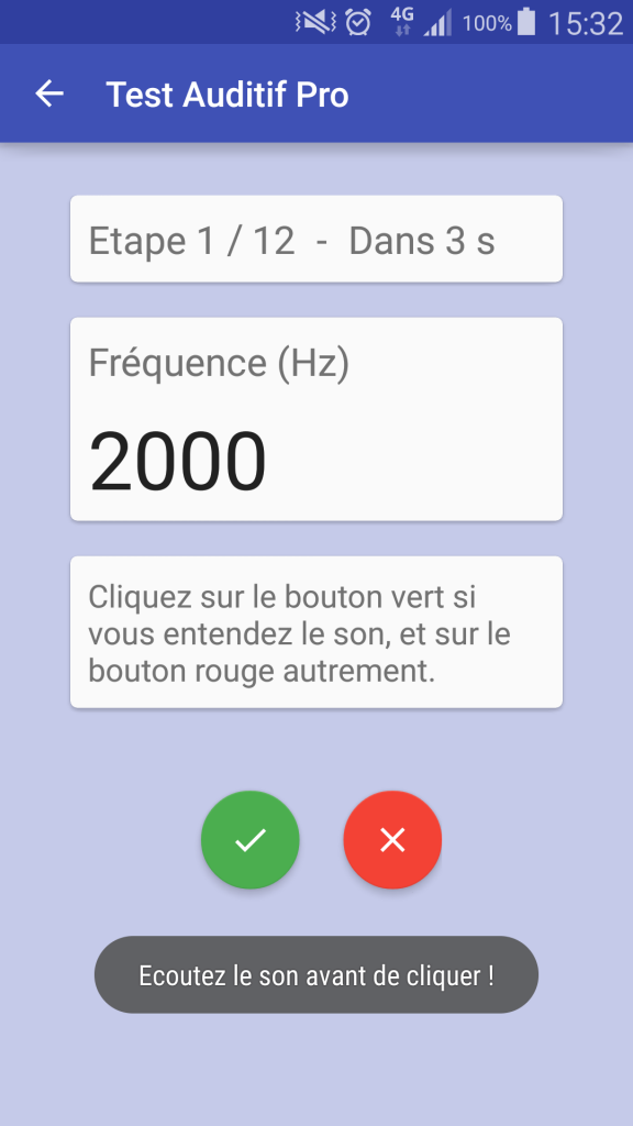
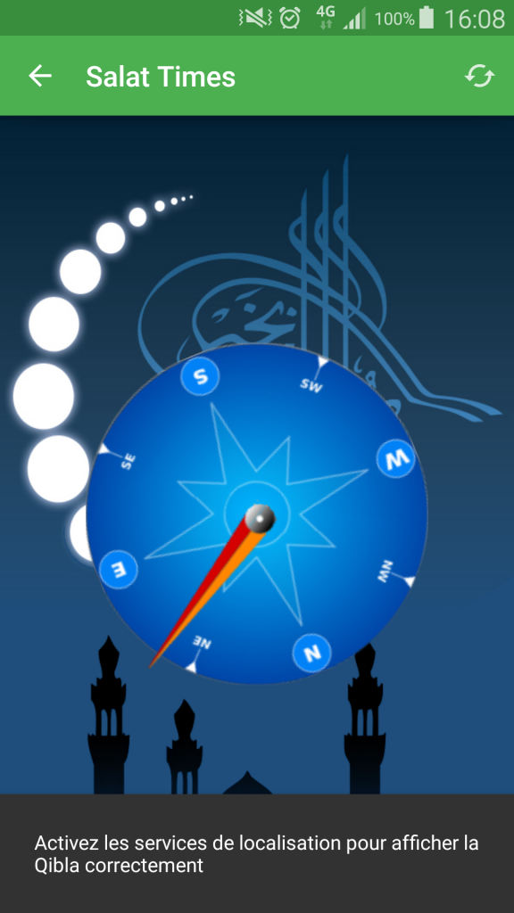
Result is rather good :
Now, you can add an action to your Snackbar and add a click listener like that :
import android.support.design.widget.Snackbar;

public class MainActivity extends AppCompatActivity ...

final View.OnClickListener clickListener = new View.OnClickListener() {
  public void onClick(View v) {
    // manage click ...
  }
};

final View coordinatorLayoutView = findViewById(R.id.snackbarPosition);

Snackbar
  .make(coordinatorLayoutView, R.string.snackbar_text, Snackbar.LENGTH_SHORT)
  .setAction(R.string.action_undo, clickListener)
  .show();
Last word to add that Snackbar support formatted texts created via Html.fromHtml() static method for example. It could be great to put in bold texts in your message.
Conclusion
Easy to use and letting you to add actions, Snackbars are great and should be used in your Android applications to replace Toasts. Don’t hesitate and adopt the Snackbars !

Leave a Reply
You must be logged in to post a comment.